


Making a Twitter-like comment and reply thread
A lazy hack to making a comment and reply thread


INTRO
Hello, sure you are good. I tried out something recently and thought it was worth sharing. You guessed right, it is simple and basic. In fact, you only require HTML and CSS knowledge to try it out. You need to be a lazy mind like me to find it interesting. So I built a “thread”, inspired by Twitter thread. It is my first tech article and I hope you enjoy it. Let’s get started. 🤓
"Today, we work"
PREREQUISITE
Basic knowledge of HTML and CSS
Ensure you have a computer, a browser and an editor to try this. You can use online code editors like codepen, as a good alternative.
THINGS I WILL BE USING
- Visual Studio Code
- Firefox Web Browser
- Internet Data to use images from picsum
- Vue.js
- Terminal
Kindly replace the images with yours if you prefer that. You do not require vue nor the terminal to implement or try this.
THINGS I IGNORED
- Conventional class naming methodology
- Responsiveness (though it is “very” responsive on most devices)
- Accessibility
CREATING OUR COMPONENT
Just in case, I will be using a Vue file for this though I consider it as an overkill (tech bros calls it "over engineering" 🤐) but it will make some part of the experimenting much easy. Henceforth, consider the <template></template> section as a .html file and <style></style> section as a .css file.
If you are using vue, you need to copy the html part into your template but ensure you wrap it in a
<div</div>because of the iteration, and the CSS into your styles.
<div class="comment-reply" v-for="i in 2" :key="i">
      <div class="comment-card">
        <img src="https://picsum.photos/200" alt="user image" />

        <div class="content">
          <div class="details">
            <div class="user-info">
              <a href="http://" target="_blank" rel="noopener noreferrer">username</a>
              <span class="action">action performed</span>
              <a href="http://" target="_blank" rel="noopener noreferrer">recepient</a>
            </div>

            <div class="date">Date(relative date)</div>
          </div>

          <p>
            Quibusdam perferendis reprehenderit consequatur qui quae nihil
            voluptate, rem, ipsa a recusandae voluptatum quo deleniti nam velit
            optio, labore aut nostrum. Facilis, ab eveniet. Nisi, perspiciatis
            cum?
          </p>
        </div>
      </div>

      <div class="reply-card" v-for="i in 2" :key="i">
        <img src="https://picsum.photos/200" alt="user image" />

        <div class="content">
          <div class="details">
            <div class="user-info">
              <a href="http://" target="_blank" rel="noopener noreferrer">username</a>
              <span class="action">action performed</span>
              <a href="http://" target="_blank" rel="noopener noreferrer">recepient</a>
            </div>

            <div class="date">Date(relative date)</div>
          </div>

          <p>
            Asperiores at repellendus, commodi debitis incidunt temporibus.
            Veniam, mollitia consectetur modi quas ad placeat repellat sunt!
            Nulla ratione impedit ipsum perspiciatis saepe in eaque fugiat
            suscipit eos!
          </p>
        </div>
      </div>
    </div>
Remember a thread in Twitter is of this structure; a post has comment(s) with each comment having replies. That means we need a component to mimic that tradition. So we created two card elements wrapped in a container, to help group them together. The cards have similar designs and behaviour.
Maybe you noticed v-for="i in 2" :key="i" as an attribute in some part of the HTML and that is an helper from vue to aid iteration.
STYLING OUR COMPONENT
.comment-reply {
  position: relative;
  font-size: 14px;
}

.comment-reply .content {
  width: 100%;
}

img {
  width: 40px;
  height: 40px;
  margin: 5px;
  border: 1px solid transparent;
  border-radius: 50%;
  object-fit: cover;
}

[class*='-card'] {
  position: relative;
  display: flex;
}

.comment-reply:not(:last-child)::before,
.reply-card:not(:last-child)::before {
  position: absolute;
  top: 30px; /** ("img height" / 2) + (margin-top * 2) */
  left: 26px; /** (("img width" + margin) / 2) + ("::before border width" / 2) */
  content: '';
  width: 0;
  height: 100%;
  border-left: 2px solid rgba(128, 128, 128, 0.5);
  z-index: -1;
}

.reply-card {
  margin-left: 60px; /** "img width" + ("img margin" * 2) + ".content padding" */
}

.content {
  padding: 10px;
}

.details {
  display: flex;
  justify-content: space-between;
  color: gray;
  font-size: 12px;
}

.details span {
  margin: 0 2px;
}

.details a {
  text-decoration: none;
}

.details a:hover {
  text-decoration: underline;
}
Seems the code is explanatory
What we did here is to basically add position to our containers in order to use the containers' ::before(:before) pseudo-element. We only need to provide it with an content, height and border-left properties (with each having a value) to begin styling it. Then we applied a position with a top and left property and value to ensured it is well positioned to our satisfaction and Voilà , we have this.
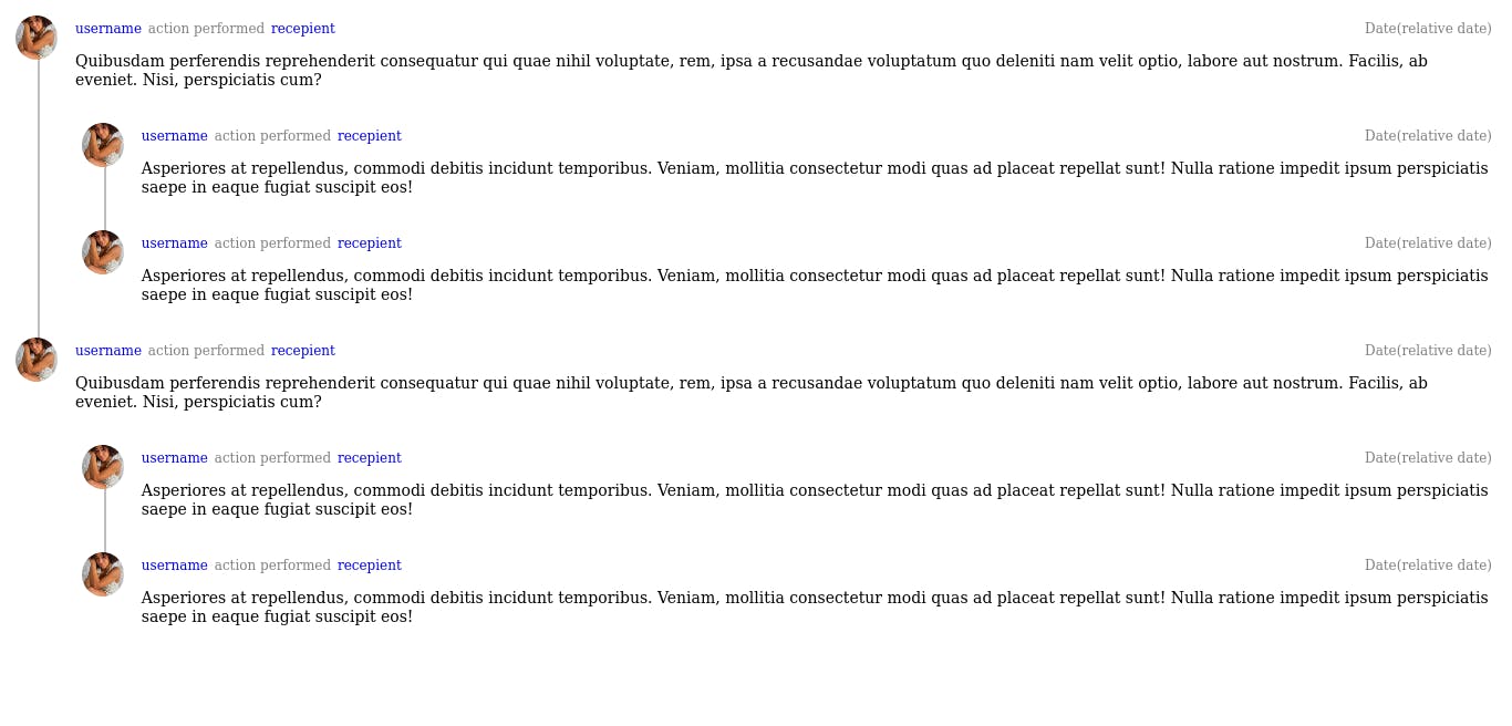
The calculations expressed in the comment of the CSS are to show how actions are taken to ensure some level of precision, it maybe ignored.
MODIFYING OUR DESIGN
As a lover of clean and good user interface, I am inspired by a lot of things I see around me. I love the “semi-cirlce cup” wrapped around the images in CSS Tricks comment session so lets add that. Using an SVG will be better but let’s first implement with CSS only.
We need to note that we need to wrap our image with a <span></span>. Using a ::before(:before) and ::after(:after) pseudo-element with <img/> is discourages as it is a replaced element. Wrapping it in <span></span> with same width and height can save the day.
So we modify our <img/> as
<span class="img-wrap">
          <img src="https://picsum.photos/200" alt="user image" />
</span>
Then we modify the styles too.
.img-wrap {
  position: relative;
}

.img-wrap::before {
  position: absolute;
  top: 2px; /** desired distace away */
  left: 1px; /** desired distace away */
  content: '';
  width: 46px;
  height: 46px;
  border: 2px solid transparent;
  border-bottom-color: rgba(128, 128, 128, 0.733);
  border-radius: 50%;
}

.comment-reply:not(:last-child)::before,
.reply-card:not(:last-child)::before {
  position: absolute;
  /* top: 30px; */ /** ("img height" / 2) + (margin-top * 2) */
  top: 50px; /** "img height" + (margin-top * 2) */
  left: 26px; /** (("img width" + margin) / 2) + ("::before border width" / 2) */
  content: '';
  width: 0;
  /* height: 100%; */
  height: calc(100% - 40px); /** "main element height" - img height */
  border-left: 2px solid rgba(128, 128, 128, 0.5);
  z-index: -1;
}
I left the comments to help understand what changed and got replaced.
And tada, it is done.
You can add
border-right-color: rgba(128, 128, 128, 0.733);andtransform: rotate(45deg);to our.img-wrap::beforeclass to have a "full cup shape" as against the "saucer" we already have.
The SVG version looks like this. Let's leave that for another time to keep it simple as I claimed. 😉
JUST IN CASE
This applies to the post thread, just in case you are curious it is not in the title.
EXTRA READS
Check Why CSS ::before doesn’t work on inputs and images and Pseudo-elements and the image tag to read more on why ::before(:before) and ::after(:after) does not work well with <img/>.
SEE YOU SOON
Thank you for taking your time to read this, hope it helps. Care to make a reply, collaborate with me on a project and be good. I am open for new roles.